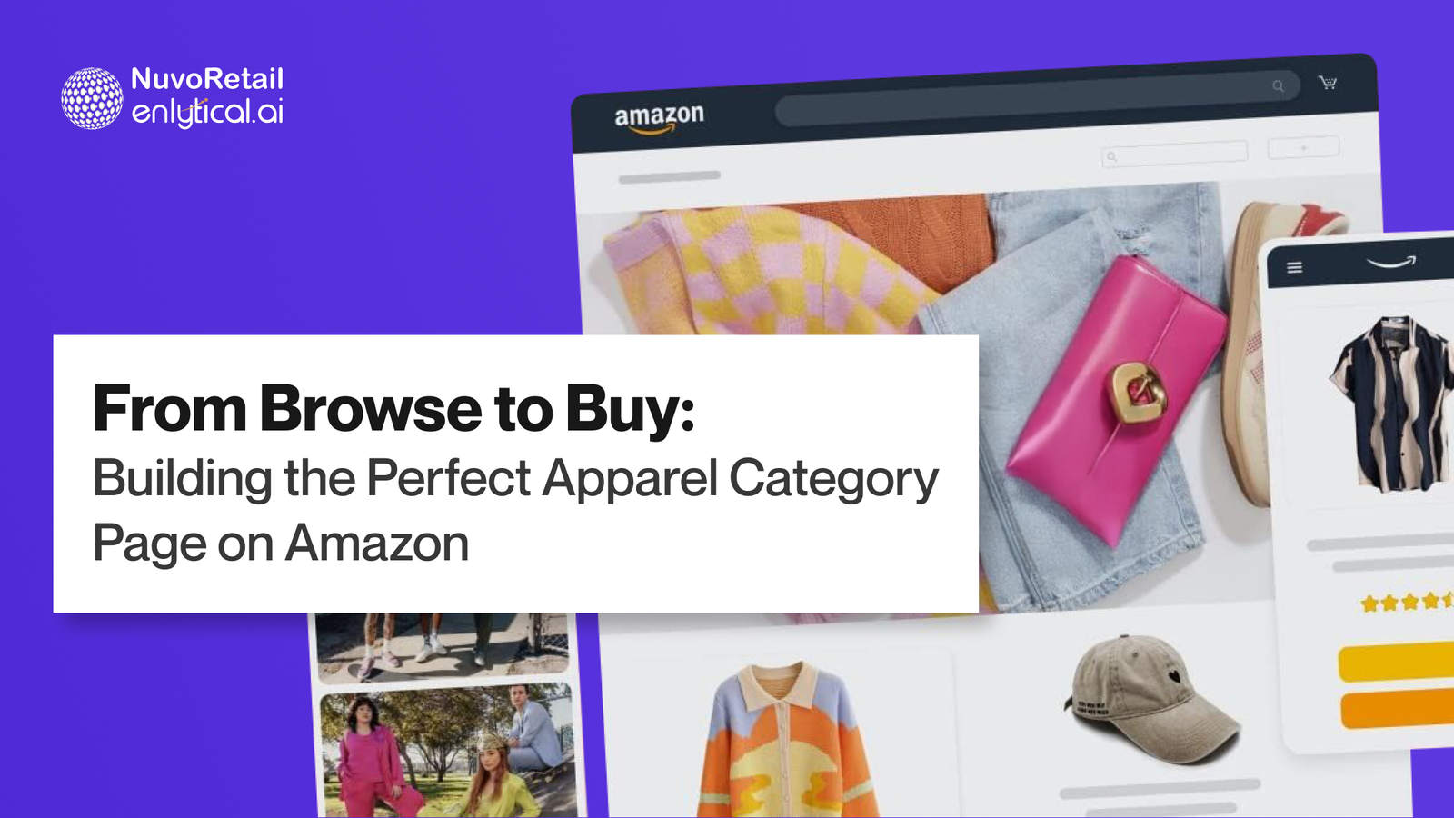
From Browse to Buy: Building the Perfect Apparel Category Page on Amazon
In the crowded world of e-commerce, your browse pages are the front door to your brand. And when it comes to apparel, first impressions are everything. Unlike search-based shopping (where the customer knows what they want), browse-based journeys are about discovery, inspiration, and nudging the user from curiosity to conversion.
Whether you’re selling on your own DTC platform or marketplaces like Amazon, crafting intuitive and visually-rich product listings is essential to capture attention and convert scrolls into sales. From the browse grid to A+ Content on your PDPs, every element must work together to enhance product appeal and shopper confidence.
So how do you design a seamless, visually appealing, and intuitive browse experience for your apparel category? Here are the best practices you should be following:
Prioritize High-Quality Imagery Across Product Listings
Apparel is highly visual. Customers can’t touch, feel, or try items online, so your product photos do all the talking.
Use a mix of studio and lifestyle shots to show how garments move and fit in real life.
Highlight fabric texture and detail with close-ups.
Ensure consistency in lighting and background to create a clean, organized visual grid.
Always show the product from multiple angles, especially the back and side views for tops, dresses, and outerwear.
Pro Tip: Use on-model photography for scale and fit context. Include height and size info of the model for transparency – a tactic especially valuable for Amazon product listings, where visuals often speak louder than words.
Curate Filters That Reflect Real Shopping Habits on Amazon
The wrong filters = frustrated users. Make it easy for customers to find what they’re looking for.
Key filters for apparel:
Type (Shirts, Dresses, Jeans, etc.)
Fit (Slim, Oversized, Regular)
Length (Crop, Midi, Maxi)
Sleeve & Neckline Types
Fabric/Material (Cotton, Linen, Polyester, etc.)
Color – with visual swatches, not just names
Size availability – real-time, dynamically updating
Occasion (Workwear, Casual, Party, etc.)
Pro Tip: Don’t overwhelm – prioritize the most-used filters first and hide less-used ones under “More”. Platforms like Amazon often benefit from backend filter tags that match user browsing intent.
Leverage Trend-Driven & Seasonal Merchandising in A+ Content
Shoppers love curated experiences. Use your category pages to tap into what’s trending now.
Create seasonal edits like “Monsoon Layering Essentials” or “Summer Co-ord Sets”.
Highlight trends like “Quiet Luxury”, “Y2K Fashion”, or “Athleisure Staples”.
Use banners and quick-access sliders for “New Arrivals”, “Back in Stock” and “Bestsellers”.
Pro Tip: Combine data and creativity – monitor what’s trending on social or Amazon’s bestseller rankings and align it with your catalog. Mirror these collections in A+ Content to drive a consistent story from grid to product page.
Optimize Product Listings for Size Confidence
One of the biggest barriers to online apparel shopping is sizing anxiety. Reduce friction with:
Size filters that show only in-stock items
Size charts customized by category (e.g., tops vs jeans)
Fit tags like “Runs Small” or “True to Size”
Model size references in every product image
User reviews that mention fit and sizing
Pro Tip: Add a “Find My Fit” quiz or tool to suggest sizes based on body type or previous purchases. This kind of personalized recommendation boosts confidence even on global marketplaces like Amazon, where trial is not possible.
Use Smart Sort & Personalization to Enhance Product Discovery
Default sorting matters. Don’t just list by “Newest First.”
Offer smart sort options like:
“Most Popular”
“Recommended for You”
“Price: Low to High”
For returning users, personalize listings based on previous browsing or buying behavior.
Pro Tip: A/B test your sort order regularly to improve conversion rates. On Amazon, replicate smart prioritization using strategic titles, bullet points, and enhanced A+ Content that supports search behavior and purchase decisions.
Integrate “Complete the Look” Bundles in Amazon Listings
Capitalize on the discovery behavior by recommending styling ideas right from the browse page.
Add hover-over carousels showing complementary pieces (e.g., jackets with dresses, shoes with jeans).
Bundle similar styles with different colors or prints.
Pro Tip: Use these widgets to increase AOV (Average Order Value) and reduce decision fatigue. On Amazon, this can be extended by using “Frequently Bought Together” sections and A+ Content comparison tables to drive cross-sell.
Design Mobile-First Product Listings That Load Fast & Convert
Apparel shopping is often done on-the-go. Your browse experience needs to be optimized for mobile users.
Ensure filter panels are collapsible and sticky
Enable pinch-to-zoom on product images
Keep text readable and buttons easily tappable
Minimize load time with lazy-loading images
Pro Tip: Test your mobile category pages on both Android and iOS regularly. Many Amazon shoppers browse almost exclusively via the mobile app – so ensure all visuals and A+ Content are optimized for small screens
Conclusion: Let Your Browse Pages Be Your Brand Stylist
A well-optimized browse page is like having a personal stylist guiding your customer through your collection. From visuals and filters to smart sort and styling suggestions – every touchpoint should delight, guide, and convert. And whether you’re building your own e-commerce storefront or selling through Amazon, remember this: every product grid, every thumbnail, every piece of A+ Content contributes to your brand’s digital first impression. In a space as competitive as online fashion, creating a frictionless and inspiring discovery experience is what sets your brand apart.